Why Your App Store Screenshots Are Costing You Downloads (And How to Fix It)
70% of users never scroll past your first screenshot. Learn how to optimize your App Store and Google Play screenshots to boost conversions by 20-35% with our complete guide covering A/B testing, localization, and design best practices.
Optimizing your app store screenshots can boost conversions by 20-35%! So why do most developers still treat them as an afterthought?? Users spend just 7 seconds on average viewing your product page before deciding to download. Take our word for it: 7 seconds is a lot! That's three times longer than the average time spent viewing an advert on social media before scrolling on to the next piece of content.
This guide covers everything indie developers and app marketers need to know about screenshot optimization for both the App Store and Google Play, from conversion statistics to design principles, platform-specific features, and real case studies.
Why screenshots determine your app's success
Screenshots are the single most impactful visual element on your product page. Research from SplitMetrics shows that screenshot/icon optimization increases conversion rates by 18% on average, with some apps achieving improvements exceeding 60%. The math is straightforward: more conversions from the same traffic means dramatically lower customer acquisition costs.
The behavioral data tells a compelling story. Nearly 100% of users view the first 1-3 screenshots when visiting a product page, but only 9% scroll through all screenshots. Users form opinions within the first second based on visuals alone, and about 60% decide to install within 5-7 seconds. Meanwhile, only 2% of iOS users click "Read More" to view the full description. Your screenshots aren't just important, they're doing almost all the conversion work.
Platform differences matter significantly. On the App Store, your first three portrait screenshots appear directly in search results alongside your icon and title. Many installs happen here before users even visit your product page. On Google Play, only your icon appears in search results, making the first screenshot on your product page even more critical for conversion.
The optimal screenshot structure
The most effective screenshot galleries follow a Value-Usage-Trust framework for the first three positions:
Screenshot 1 (Value Promise): Your single most important asset. This screenshot must immediately communicate what the user gets and why they should care. Use benefit-driven headlines of 3-5 words maximum. Apps like Calm lead with "Sleep better, feel better" backdropped by peaceful nature imagery, utilizing strong emotional messaging to encourage download.
Screenshot 2 (Key Usage): Show how the app works through one clear action. This demonstrates the core experience without overwhelming users with features. Duolingo excels here, showing the actual lesson interface with the headline "The fun, free way to learn a language."
Screenshot 3 (Trust/Social Proof): Include ratings, awards, media quotes, or download counts. Klarna effectively combines its logo with Trustpilot ratings, while Asana prominently displays industry awards. Apps improving ratings from 3.6 to 4.2 stars see nearly 60% higher conversion rates.
For screenshots 4-10, focus on secondary features, unique differentiators, and additional use cases. However, optimize these with lower priority, sadly the vast majority of users will never see them.
Text and copywriting that converts
Screenshot captions should follow a strict formula: Verb + Benefit + Result in 3-5 words maximum. Examples include "Plan better. Achieve more." and "Edit easily. Share instantly." Text must be benefit-driven rather than feature-focused: "Track your workouts effortlessly" outperforms "Workout tracker app" because users care about outcomes, not capabilities.
Typography requires high contrast and mobile-first sizing. Test captions on actual devices at App Store thumbnail scale. According to some research, larger text elements elicit stronger emotional responses, and apps with bold, clear captions convert higher than those without text overlays.
Localization delivers outsized returns
Screenshot localization generates 15-40% conversion improvements in non-English markets, with some apps achieving up to 200% conversion rate uplift. ZiMAD saw a 36% conversion increase when localizing Magic Jigsaw Puzzles for the Japanese market, but the optimization went beyond translation.
Japanese users prefer screenshots with many small elements, special effects, and emotional captures, contrasting with Western minimalist preferences. Effective localization means adapting visual design to cultural expectations, not just translating text. Priority markets for localization include the United States, China (Simplified Chinese), Japan, Germany, France, South Korea, and Spanish-speaking markets.
Let's take a look at this example: do you know that you can have different screenshots for each country? Here is the example of Uber's screenshots on iOS in the US and also in Taiwan. Yep, they're super different!
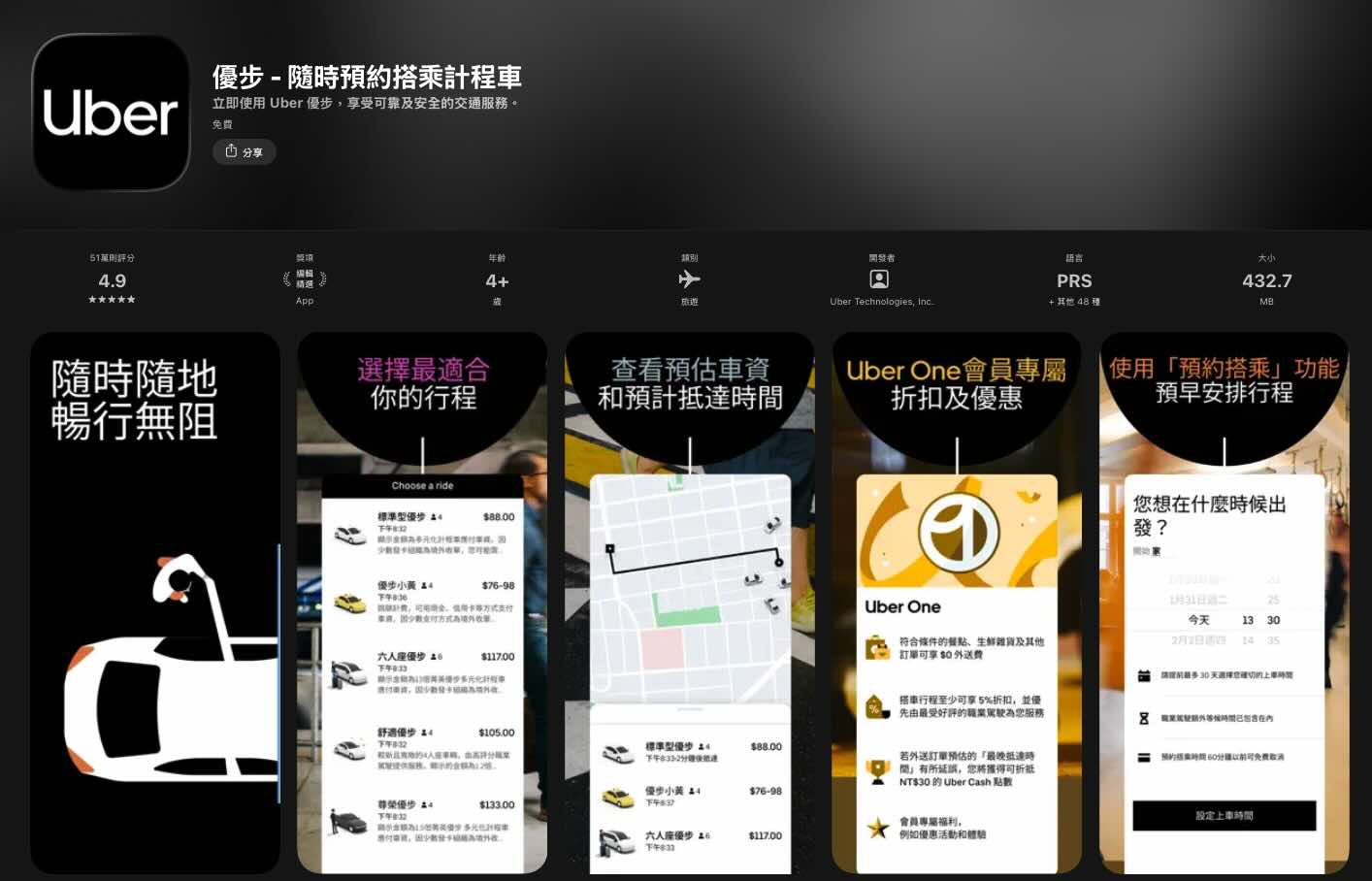
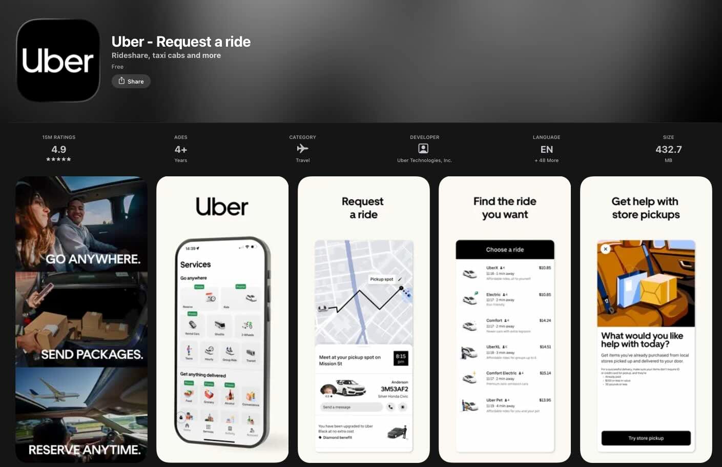
Same app, but different features promoted and radically different visual styles. Why? Because Uber did A/B testing in each country!
Custom Product Pages and Custom Store Listings
Apple's Custom Product Pages (CPP) allow up to 70 alternate versions of your product page with customized screenshots, promotional text, and preview videos. Each CPP gets a unique URL for marketing campaigns or can be assigned keywords for organic search visibility.
Best practices for CPPs include aligning messaging with specific ad campaigns, creating audience-specific pages, and testing different value propositions for different traffic sources. CPPs require App Review approval but operate independently from app updates.
Google's Custom Store Listings (CSL) offer even more flexibility with up to 50 alternate listings per app. Unlike Apple, Google allows customization of the app name, icon, and descriptions, not just screenshots. CSLs can target by country, user state (new, returning, inactive), search keywords, or Google Ads campaigns.
A/B testing capabilities on both platforms
Apple's Product Page Optimization (PPO) enables testing up to 3 treatments plus your original, running for maximum 90 days. You can test icons (requires including variants in app binary), screenshots, and preview videos, but not text metadata. Only one test runs at a time, and results show in App Store Connect analytics with confidence levels.
Google Play Store Listing Experiments offer more flexibility: unlimited test duration, ability to test descriptions alongside visual assets, and up to 5 localized experiments running simultaneously. You can set Minimum Detectable Effect and choose confidence levels from 90-99%. Tests run on main listings or Custom Store Listings.
Design principles that drive downloads
Effective screenshots share common characteristics: one clear message per image, high-quality visuals without clutter, readable text overlays with high contrast, and consistent brand identity. Color psychology plays a role: blue and green convey trust (ideal for finance apps), while red and orange create urgency and excitement (games, e-commerce).
The most common mistakes include cluttered screenshots with illegible text, small fonts with poor contrast, too much information per screen, outdated device mockups, and failing to communicate the app's core function within 3 seconds. Apps like Uber demonstrate best practices with dark backgrounds, contrasting white fonts, and uncluttered visuals that explain the booking concept instantly.
A few great examples available on the Play Store & App Store
Theory is great, but nothing beats looking at what's actually working in the wild. The best way to level up your screenshot game? Study the apps that nail it. Whether they're leveraging bold storytelling, minimalist design, or clever copywriting, these examples prove there's no one-size-fits-all formula (just smart execution tailored to their audience). Let's break down a few standout approaches you can learn from (and yes, steal inspiration from... guilt-free 🤫).
Kept: when Less is More
Take Kept, an AI-powered journaling app. On paper, there's nothing revolutionary: dozens of apps promise the same thing. But scroll through their App Store screenshots and you'll immediately understand what sets them apart.
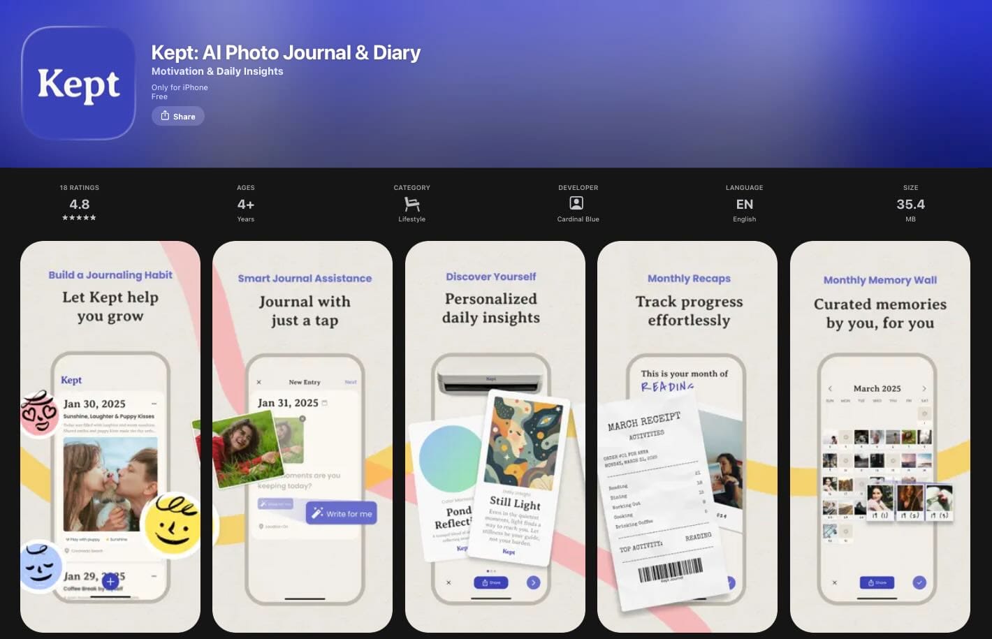
Each screenshot highlights one core feature with crystal-clear messaging, clean typography, and a minimalist design that lets the product speak for itself. There's no visual clutter, no overwhelming feature lists, no fancy 3D mockups fighting for attention. Just the app interface, a benefit-driven headline, and plenty of breathing room. It's a powerful reminder that great screenshots aren't about cramming in as many elements as possible... they're about communicating value instantly. Kept proves that restraint and clarity can be your biggest competitive advantage in a crowded market.
Bump: Know your audience, design for them
Now let's look at the complete opposite approach. Bump's screenshots are packed with effects, bold colors, text overlays, and visual energy everywhere. At first glance, you might think it breaks all the "keep it simple" rules we just praised Kept for. But here's the thing; it works brilliantly.
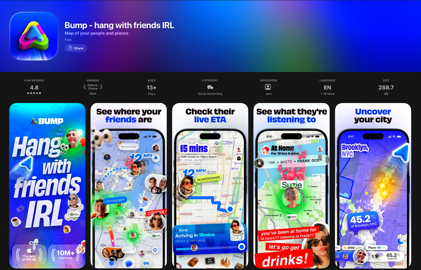
Why? Because Bump knows exactly who they're talking to. Their target audience responds to vibrant, dynamic visuals that match the app's fun and social vibe. What would feel cluttered for a journaling app feels exciting and on-brand for Bump's users.
This is the real lesson: there's no universal formula for great screenshots. Minimalism isn't always the answer, and neither is maximalism. The only rule that truly matters? Know your target audience inside out and design for them, not for design awards. Kept and Bump sit at opposite ends of the spectrum, yet both nail it; because both understand who they're selling to.
Headspace: Sell the transformation, not the features
Headspace takes a masterful approach to screenshot copywriting. Instead of listing features like "guided meditations" or "sleep stories," they focus entirely on what users actually want: "Better mental health," "Stress less," "Sleep soundly." That's it...
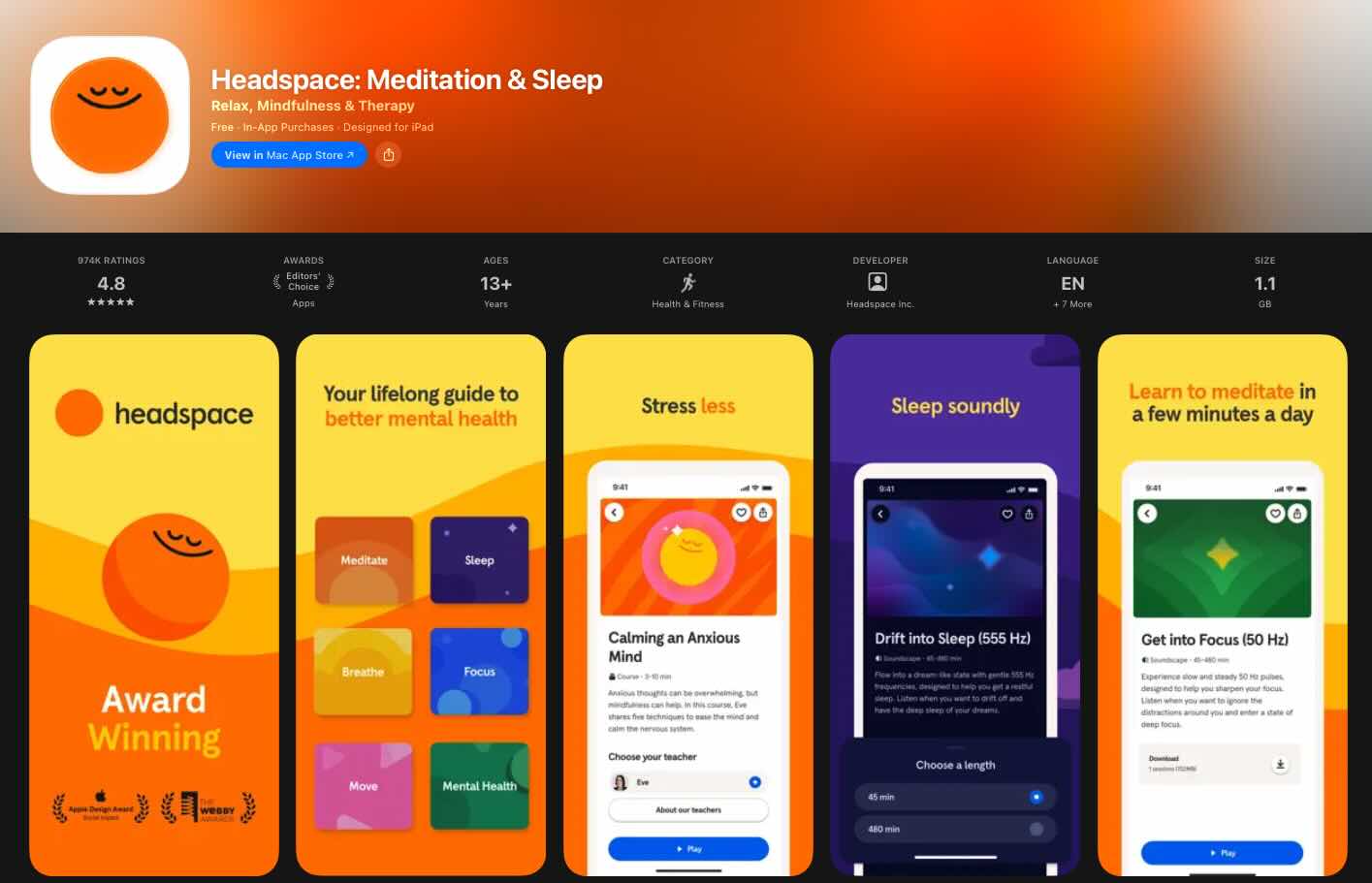
...No jargon, no feature dumps. Just clear, confident and emotional outcomes that speak directly to why someone would download a meditation app in the first place. The design follows the same philosophy: calm colors, minimal UI, zero clutter
Everything reinforces the feeling of peace you're hoping to find. And here's the smart part: they also weave in their awards and accolades without making it feel like bragging. It's subtle social proof that builds trust while keeping the focus on benefits. Headspace proves that the best screenshots don't explain what your app does; they show users who they'll become after using it. That's the difference between selling a product and selling a transformation.
Corner: Speak your audience's language
Corner absolutely nails the Gen Z aesthetic and more importantly, the Gen Z voice. Just look at their copy: "finally... a map that shows you places you actually want to go to," "vibe check places," "reviews from real people, no bots or ads." This isn't corporate marketing speak; it's how their target audience actually talks. The casual tone, the asterisks for emphasis, the word "vibe", every detail feels Gen-Z native.
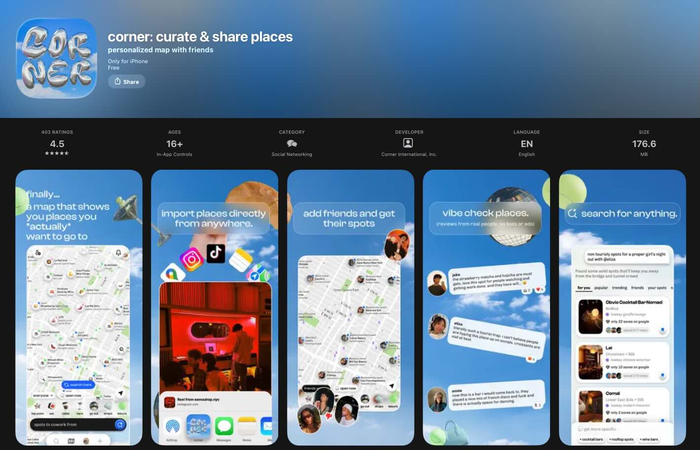
The design reinforces it perfectly: dreamy blue gradients, playful 3D balloon-style elements, and a layout that feels more like a mood board than a traditional app listing. They even show importing places directly from TikTok and Instagram, speaking directly to user behavior. Corner's screenshots don't just describe features, they create a vibe that makes their ideal user think, "this app gets me." That emotional connection happens in seconds, and it's what separates forgettable screenshots from ones that convert.
Where to find endless inspiration: @screenshotfirst on X
If you're looking for a constant stream of screenshot inspiration, we highly recommend following The Screenshot First Company on X (@screenshotfirst). They curate some of the best app store screenshot examples out there and regularly share redesign concepts that are genuinely jaw-dropping.
Favorite bits from December 🌈
— the screenshot first company (@screenshotfirst) January 5, 2026
Apps: ForReal, Character AI, askUs, Lingolooper
Which App Store screenshots catch your eye the most? pic.twitter.com/WEV2tT77z9
Watching them transform a mediocre screenshot set into a conversion machine is both humbling (yes...) and incredibly educational. Beware though; it's the kind of content that makes you immediately want to open Figma and rethink your entire visual strategy.
New work 🌈
— the screenshot first company (@screenshotfirst) December 31, 2025
Just before the New Year, we helped @frboulais relaunch his app. We prepared a set of new App Store screenshots to support the big update!
Such a lovely idea and app! Don’t forget to check it out. https://t.co/zJwcFVp621 pic.twitter.com/DeRJW9HmkD
Fun fact: they've actually featured Kept as a standout example in the past, so you know their taste is on point. Whether you're an indie dev looking for ideas or a seasoned ASO pro hunting for fresh trends, this account is a goldmine. Go hit that follow button!
Immediate optimization checklist
Ok let's break it down. Start with an audit of your first three screenshots against the Value-Usage-Trust framework. Add benefit-driven captions using the Verb + Benefit + Result formula. Increase text contrast for readability at thumbnail size. Remove status bar clutter (battery, time, wifi icons).
For short-term wins, localize for priority markets starting with: China, Japan, and Germany. (Of course - do your research and go where your users are if you have the data to hand!) A/B test your first screenshot; the highest-impact single change you can make - and finally, sprinkle some of the 'social proof' elements we previously discussed where appropriate.
Establish an ongoing rhythm of updating screenshots 2-4 times annually, testing one variable at a time, monitoring conversion rates after each update, and researching competitor creative strategies using tools like AppTweak.
The opportunity in screenshot optimization remains substantial. Most developers invest heavily in acquiring users while neglecting the conversion funnel that determines whether those users actually download. A 20-35% conversion improvement from optimized screenshots effectively reduces your cost per install by 20-35%, compounding returns on every marketing dollar spent. We hope if this blog article has proved anything, it's that screenshot optimization is not just worthwhile - it's achievable.


Comments ()